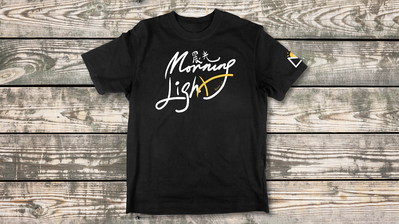
Morning Light Fellowship logo redesign
Why redesigning?
• Out-of-date font and style
• Lack of energy
• Lack of color
• Lack of vector file or high res PNG file
• New Vision
Goal of the redesign logo
• Energy and Modern design
• Minimalist design
• Elements related to the fellowship name
• High res transparency fileSolution
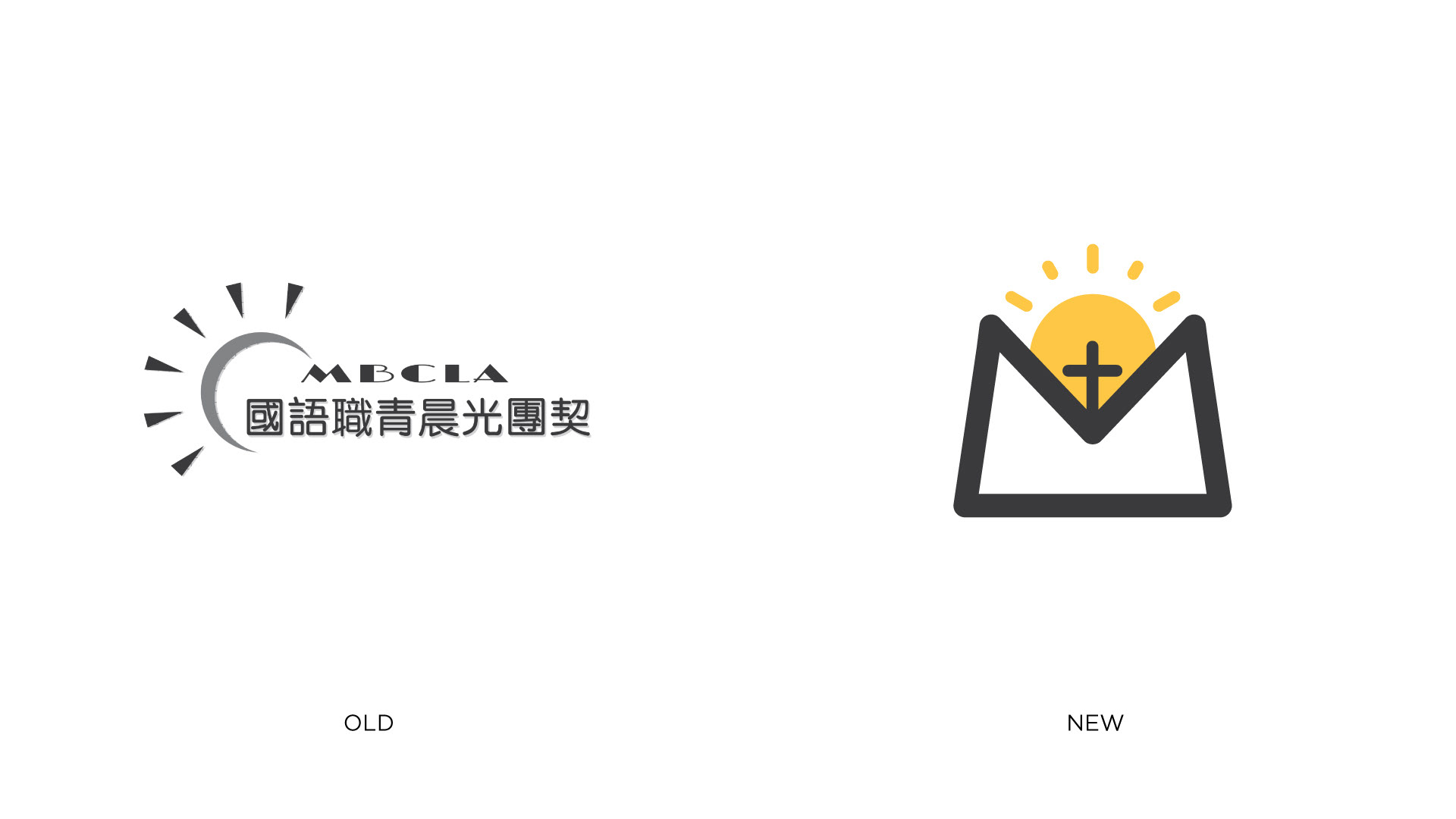
In order to achieve all the goals we set, we need to design the new logo in a new vision. First of all, we decide to use the concept of the fellowship name "Morning Light" instead of putting the whole name into the design. Therefore, we can have a minimalist and clean design.

Process
The new logo is a sun rising up from a mountain which referring to our name "Morning Light." I use solid shape, line and negative space to keep the whole design clean. I also I keep the sun symbol from the old design and turn it into a solid symbol. The fellowship name starts with M and we are a Mandarin fellowship so I combine the mountain and "M" together to create a "M" shape mountain.
Color
Yellow is a color full of energy. Therefore, I pick this warm yellow color to be logo color.