Hong Kong Space Museum | Rebranding Project
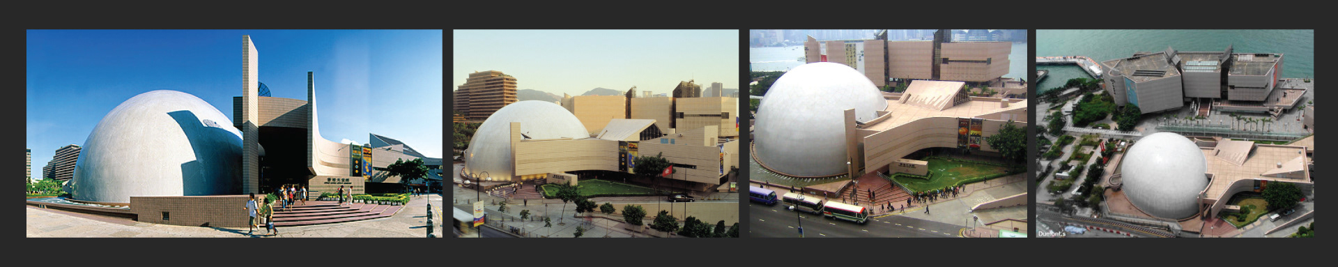
Hong kong Space museum is a museum of astronomy and space science in Hong Kong opened on 1980. Its egg-shape dome is one of the symbolic icons of Hong Kong.
The idea of rebranding a museum first popped into my head as I was brainstorming for my portfolio work two years ago.
The museum remodeled of exhibition halls in ordering to have a new simulated environment and interactive exhibits for visitors. However, the website and branding of the museum did not give me a sense of remodeling. Different to many modern museum, Hong Kong Space Museum did not have a user-friendly website with high quality exterior and interior photos and information. I believe remodeling should not only focus on the building, but also think of the branding. Therefore, I decided to pick Hong kong Space museum for my museum project.
This was not an easy project because of the lack of resources and it postponed the due date of the design for a long time. But it motivated me to keep working on this project and get it done.
Logo Concept
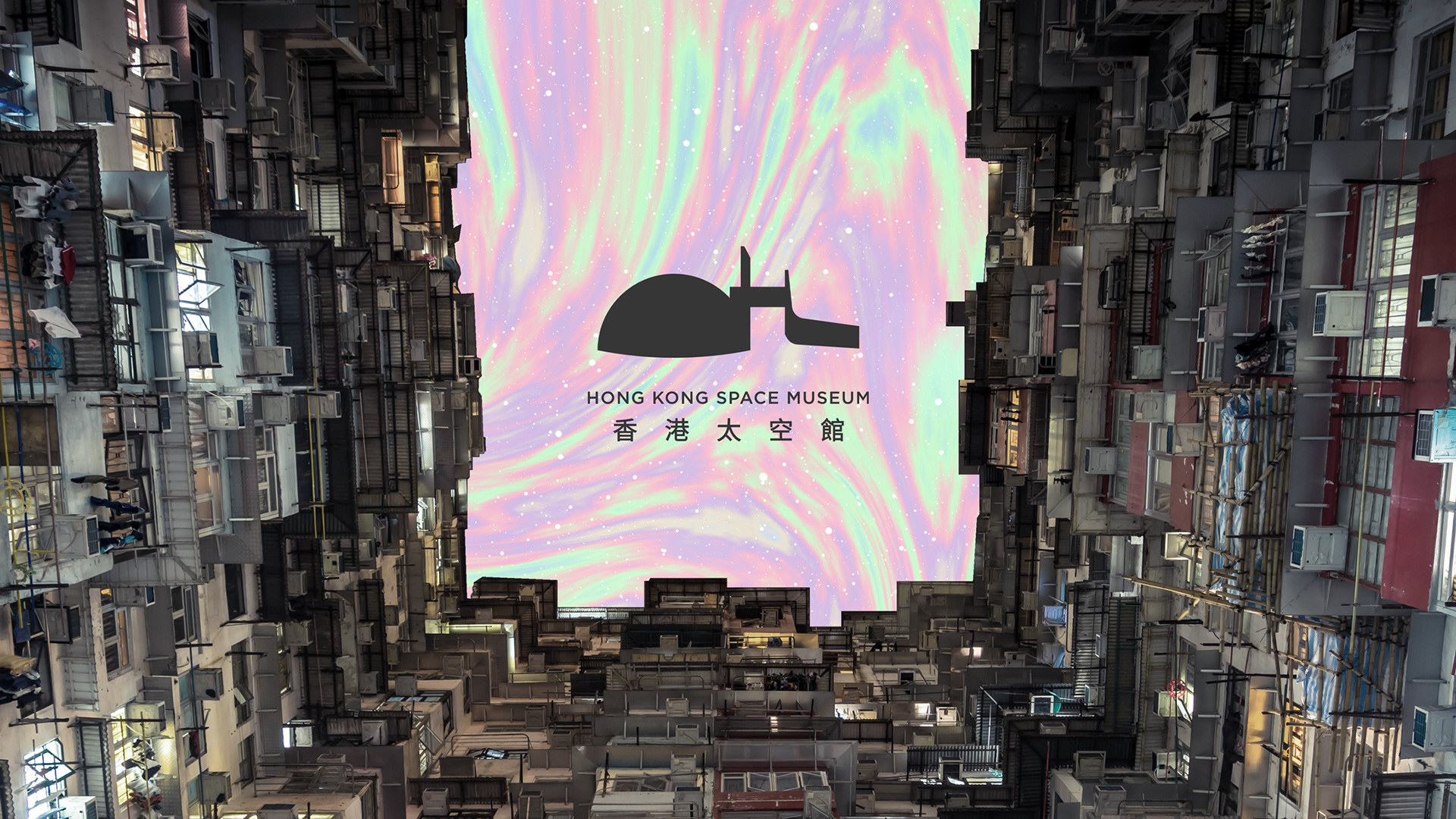
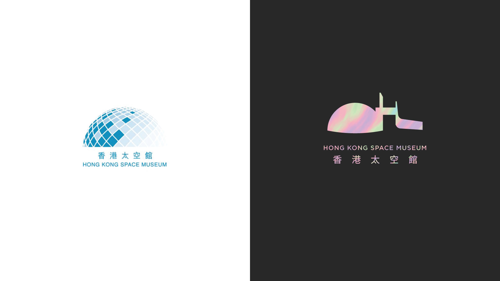
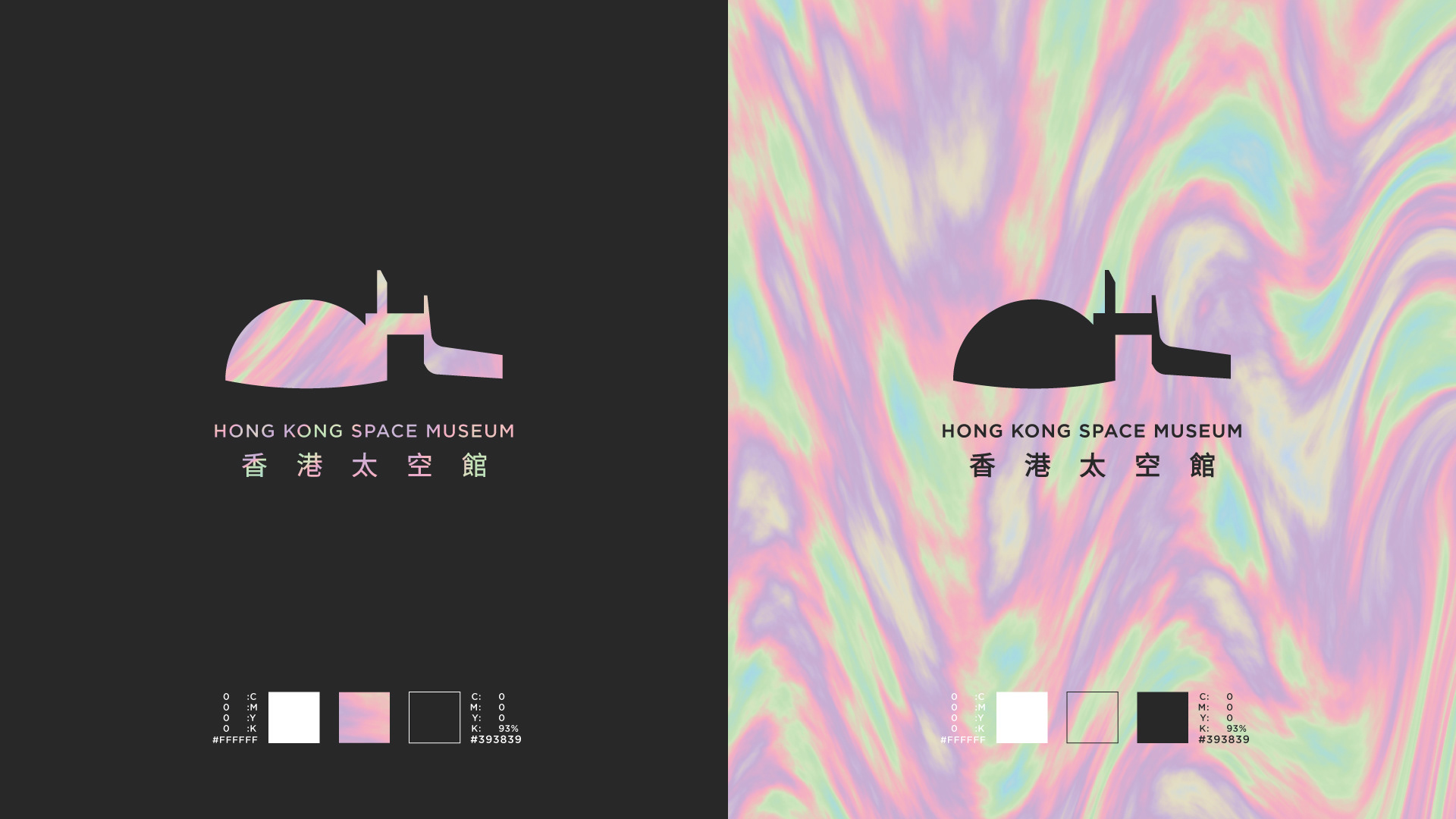
The existing logo emphasized the dome shape of the museum. Since this is the symbol representing the space museum, I will keep this in my design but in a a different way. Instead of the egg-shape dome, I used the silhouette of the whole building as the main element of the logo.
Design Guide and Color Palette
The existing logo had a bluish color palette which is a safe color for a logo. I would like to have a very different color platte. Holographic is not a traditionl solid color but it gives a feeling of nebula. As a result, I picked white, matte black and opal-holographic as the color palette.
Typography
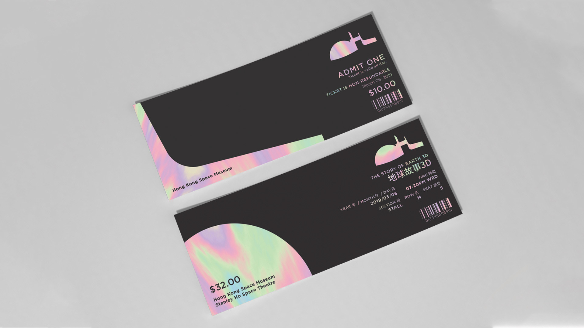
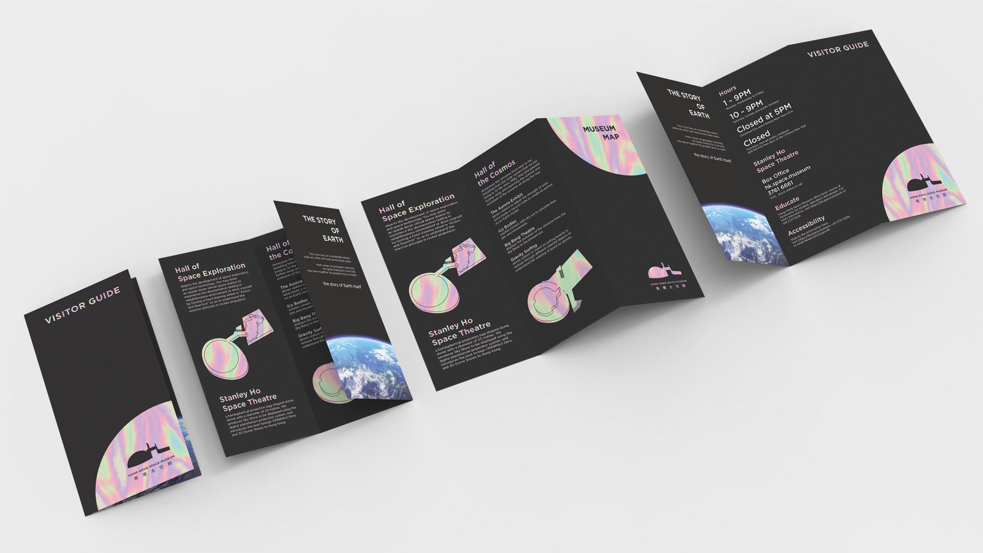
Tickets and Visitor Guide